


November 26, 2025
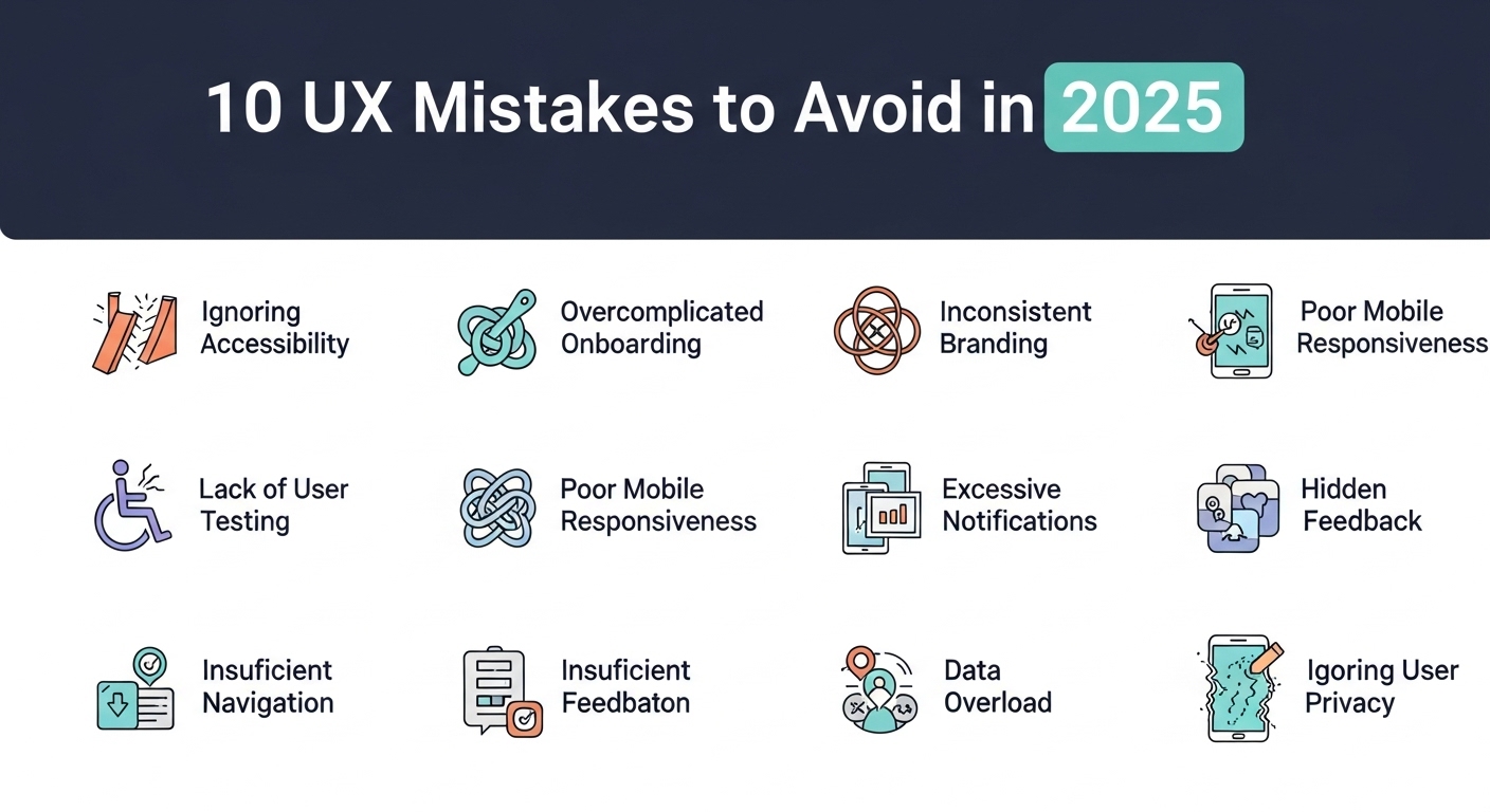
Ten UX Mistakes to Avoid in 2025
We've all done it: clicked on a website that looked fantastic and then left immediately because something didn't feel right. The buttons might have been playing hide-and-seek, or the slow loading time might have made you think your internet connection wasn't working. As we get closer to 2025, user experience has never been more vital for your digital success. We've seen a lot of businesses lose consumers at Peak Media Consulting because their websites weren't easy to use. The good news is? It's easy to avoid most of these blunders. Here are the top ten UX mistakes you should avoid this year. 1. Not paying attention to the design that works best on mobile devices Here's a reality check: more than 60% of people who go to websites do it on their phones. There are still websites that don't put mobile first. Your users are looking through their phones while they are on the bus, in a queue, or just relaxing at home. If your site doesn't look good on a small screen, most of your visitors won't be able to see it. The answer is to make things for mobile devices first, and then make them bigger for desktop. Making a site that operates properly on all devices isn't enough. You also need to make it feel like it fits in with the device your user is using. 2. Making it too hard to go around Have you ever gone to a store and not been able to find what you were looking for? That's how people feel when they have to deal with navigation that doesn't make sense. In 2025, simple wins. Your visitors should be able to find what they want in three clicks or fewer. Think of how you move around as a discussion with your user. Would you give someone ten different methods to get to the same place? Not sure. Check that your menu is tidy, easy to use, and makes sense. And please, don't put dropdown menus inside of dropdown menus. That's a hole that no one wants to go down. 3. Choosing elegance over speed Yes, that cool parallax effect looks wonderful. If your page takes five seconds to load, most people won't stick around to see it. Page speed doesn't simply affect how people feel about your site; it also affects how well it ranks in search engines and how many people buy from you. Every second counts. Studies show that a one-second delay can lower conversions by 7%. Use browser caching, make your images smaller, and get rid of those big scripts. Your users and your bottom line will be happy. 4. Not paying attention to how easy it is to get to It's not just about doing the right thing, but that is vital too. Accessibility is making things that everyone can use, even the one in four adults who have a disability of some kind. If you don't think about accessibility, you're not only leaving people out, you're also losing money. Adding alt language to pictures, ensuring colours are easy to see, making your site easy to browse with a keyboard, and using clear, informative link text are all simple adjustments that can have a large effect. These reforms are good for everyone, not just those who have disabilities. 5. Asking people to do things that aren't obvious Your call-to-action (CTA) buttons should be like a friend saying, "Hey, this is what you should do next!" Instead, we regularly encounter buttons that read "Click here" or "Submit" that don't say what they mean. Be clear about what you want to do and stay focused on it. Instead of "Learn More," try "Download Your Free Guide" or "Start Your 30-Day Trial." Visually, your CTAs should stick out; they should be the most significant thing on the page. Also, remember that not every paragraph needs a call to action. Placement is highly crucial. 6. Sending users a lot of pop-ups We get it. Pop-ups can help encourage people to sign up for your email list or for advertising deals. But it's easy to cross the line between being helpful and being obnoxious. If a user can't even access your content before they have to sign up for a newsletter, see an exit-intent box, and see a cookie consent banner, you've gone too far. It's all about timing. Before you ask for someone's email address, let them interact with your content. Use exit-intent intelligently, and make sure that any pop-up can be simply closed with a button that is easy to discover. You want to get along with the other person, not make matters worse. 7. Using stock photographs that don't have anything to do with your business The greatest way to express "we don't really care" is with those too-perfect stock photographs of individuals in suits pointing at laptops with teeth that are too perfect. People can see things from a mile away, and they lose trust right away. Buy authentic photographs that show off your brand and help you connect with your audience. If you're short on cash, even good pictures of your genuine team or items on your phone are preferable to stock shots. Realness builds relationships, and relationships lead to sales. 8. Not paying attention to white space White space isn't space; it's space for your stuff to move about. When you cover every pixel with text, pictures, or calls to action, it makes things look cluttered and makes it hard for people to focus on what's important. White space is like the space between sentences when you talk. It offers readers time to think about what they've read and tells them where to go next. Some of the top websites are incredibly easy to use. They use white space in creative ways to give the site a clean and professional image. 9. Parts of the design that don't go together Imagine reading a book where the font changed with each chapter or viewing a movie where the colour grading altered at random points. That's how people feel when your design isn't the same all the time. Your brain may find it tougher to interpret these little changes, including varied button styles, fonts, and spacing. Make a design system that is easy to understand and has the same colours, fonts, spacing, and interactive elements throughout. This doesn't mean your site has to be boring; it just means that you need to make sure that everything fits together in a way that seems organised and professional. 10. Not paying attention to feedback and testing from users This is the thing: what you think works and what really works could not be the same. In 2025, the worst thing you can do for UX is to presume you know what your people want without asking them. Do user testing a lot and early on. Use heatmaps to see where people actually click. Check your analytics. Check support tickets to find out what problems users are encountering. And if someone says something isn't functioning, listen to them. Your ideas about your design are vital, but what your users think is even more crucial. Moving Forward You don't just do user experience once and forget about it. You keep doing it to learn more about your audience and how to better serve them. The digital world is continually changing, and things that function now might not work as effectively in the future. The good news is that you don't need a lot of money or a new design to avoid making these blunders. Start with little steps, put your audience's requirements first, and continuously making modifications. Every tiny modification, even if it appears small, makes the whole thing better. At Peak Media Consulting, we believe that a great user experience is the most important thing for success online. It's not about just going along with the crowd; it's about creating experiences that genuinely help your users and your business realise its goals. Not only will you make your website better by avoiding these frequent blunders, but you'll also gain your audience's trust and develop long-lasting relationships with them. Your website isn't about you; it's about your consumers and how you can help them have more fun, get more done, or make their lives easier. Keep that in mind, and you'll be well on your way to creating experiences that not only don't make these mistakes but also make your visitors very pleased. Are you ready to make your UX better? Make 2025 the year your online presence really stands out.
Read More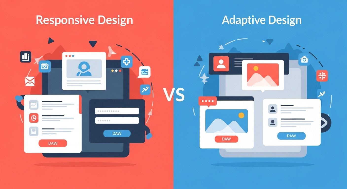
November 24, 2025
Responsive vs Adaptive Design: What’s Better in 2025?
In today's mobile-dominated world, how your website looks and functions across different devices can make or break your online success. Two powerful approaches have emerged to tackle this challenge: responsive design and adaptive design. But which one should you choose in 2025? This question isn't just technical jargon—it directly impacts your website's performance, user experience, and ultimately, your bottom line. As technology evolves and user expectations grow, understanding the nuances between these design philosophies becomes crucial for making informed decisions about your web presence. What is Responsive Design? Responsive web design is like having a website that's made of flexible material. It automatically adjusts and flows to fit any screen size, whether someone's viewing it on a smartphone, tablet, laptop, or desktop computer. Think of it as water taking the shape of whatever container you pour it into. The same content rearranges itself seamlessly based on the available screen space. This approach uses flexible grids, fluid images, and CSS media queries to create a single website version that works everywhere. When you resize your browser window and watch elements smoothly reorganize themselves, you're experiencing responsive design in action. This technique has become the industry standard since its introduction, and for good reason—it's elegant, efficient, and user-friendly. Understanding Adaptive Design Adaptive web design takes a different approach. Instead of one flexible layout, it creates multiple fixed layouts designed for specific screen sizes. When someone visits your site, the server detects their device and serves the most appropriate version. Imagine having several tailored outfits for different occasions rather than one versatile piece of clothing. Adaptive design typically includes layouts for common breakpoints like 320px, 480px, 760px, 960px, 1200px, and 1600px. This method offers more precise control over how your website appears on different devices. Each layout can be optimized specifically for its target screen size, potentially offering better performance and more customized user experiences. Key Differences Between Responsive and Adaptive Design Understanding the fundamental differences helps clarify which approach suits your needs better. Responsive design uses one fluid layout that continuously adjusts, while adaptive design employs multiple fixed layouts that snap to specific breakpoints. Development complexity differs significantly too. Responsive design generally requires less initial development time since you're building one flexible system. Adaptive design demands creating and maintaining multiple distinct layouts, which increases development effort but offers greater control. From a performance standpoint, responsive sites load one set of code that works everywhere, while adaptive sites can deliver optimized code for specific devices. This distinction affects both loading speeds and user experience, especially on mobile connections. Working with professional services like Peak Media's web design team ensures you choose and implement the right approach for your specific business needs. Advantages of Responsive Design Responsive design's popularity stems from its numerous practical benefits. First and foremost, it's cost-effective. Building and maintaining one website that works everywhere is significantly cheaper than managing multiple versions. Search engines love responsive design. Google explicitly recommends it because having one URL for all devices makes crawling, indexing, and ranking simpler. This SEO advantage alone makes responsive design attractive for businesses focused on organic traffic. Future-proofing is another major advantage. New devices with different screen sizes appear constantly—foldable phones, smart watches, unconventional tablets. Responsive design automatically accommodates these without requiring updates, ensuring your website stays functional regardless of technological evolution. The development process is also more straightforward. Your team works on one codebase, making updates and bug fixes simpler. This efficiency translates to faster deployment times and easier ongoing maintenance. Benefits of Adaptive Design Despite responsive design's popularity, adaptive design offers compelling advantages in specific scenarios. The most significant is performance optimization. Since adaptive sites serve device-specific code, they can be highly optimized for each target platform, potentially resulting in faster load times. User experience customization reaches new heights with adaptive design. You can create entirely different experiences for mobile and desktop users based on their typical behaviors and needs. For example, mobile users might see streamlined navigation and prominent call-to-action buttons, while desktop users get more detailed information and complex features. Adaptive design excels when dealing with complex existing websites. If you have a large desktop site that's difficult to make fully responsive, creating separate mobile and tablet versions might be more practical and cost-effective than a complete responsive redesign. Greater design control is another benefit. Designers can craft pixel-perfect layouts for specific devices without compromising on any screen size. This precision matters for brands with strict visual identity requirements or complex user interfaces. The Mobile-First Reality of 2025 In 2025, mobile internet usage continues dominating desktop browsing. Over 60% of web traffic comes from mobile devices, making mobile optimization non-negotiable rather than optional. This reality influences the responsive versus adaptive debate significantly. Both approaches can deliver excellent mobile experiences, but how they achieve it differs. Responsive design with a mobile-first philosophy ensures the core experience starts with mobile users, then enhances for larger screens. This approach aligns perfectly with current usage patterns. Adaptive design, when properly implemented, can create highly optimized mobile experiences tailored specifically for smartphone users. However, it requires careful planning and more resources to maintain multiple versions effectively. Peak Media's mobile optimization services help businesses navigate these considerations, ensuring their websites perform excellently across all devices regardless of which design approach they choose. Performance and Loading Speed Considerations Website speed directly impacts user satisfaction and search rankings. How responsive and adaptive designs affect performance varies based on implementation quality. Responsive sites load one set of resources that work across devices. While convenient, this means mobile users sometimes download code and images primarily designed for larger screens, potentially slowing loading times. However, modern techniques like responsive images and lazy loading mitigate these issues effectively. Adaptive sites can deliver device-specific resources, meaning mobile users only download what they need. This targeted approach can significantly improve mobile loading speeds, especially important given that mobile users often browse on slower connections. That said, poorly implemented adaptive design can actually harm performance by requiring additional server-side processing to detect devices and serve appropriate versions. The key is expert implementation rather than inherent superiority of either approach. SEO Implications in 2025 Search engine optimization remains crucial for online visibility. Google's algorithms continue emphasizing user experience, mobile-friendliness, and page speed—all factors influenced by your design approach. Responsive design maintains its SEO advantage through URL consistency. One URL for all devices means link equity isn't diluted, social shares point to a single location, and Google's crawlers have an easier job indexing your content. Adaptive design doesn't inherently hurt SEO, but it requires careful implementation. Using dynamic serving or separate mobile URLs demands proper configuration to avoid duplicate content issues. When done correctly, adaptive sites can actually rank well due to their optimized performance and tailored user experiences. Core Web Vitals, Google's user experience metrics, matter tremendously in 2025. Both design approaches can achieve excellent Core Web Vitals scores, but success depends on implementation quality rather than the chosen philosophy. Cost and Development Time Analysis Budget and timeline considerations often determine which approach businesses choose. Responsive design typically requires less initial development investment since you're building one flexible system. Ongoing maintenance is also simpler and cheaper with a single codebase. Adaptive design demands more upfront resources—you're essentially creating multiple websites. Development time increases proportionally to the number of layouts you build. However, for certain projects, this investment pays dividends through superior performance and user experience. Long-term costs tell an interesting story. While responsive sites cost less to maintain, adaptive sites might generate better conversion rates through optimized user experiences, potentially offsetting higher development costs through increased revenue. For small businesses with limited budgets, responsive design usually makes more sense. Larger enterprises with complex needs and bigger budgets might find adaptive design's advantages worth the additional investment. Which Approach Wins in 2025? The honest answer? It depends on your specific situation, goals, and resources. There's no universal winner—only the right choice for your particular needs. Responsive design remains the better choice for most businesses in 2025. Its cost-effectiveness, SEO benefits, ease of maintenance, and automatic future-proofing make it ideal for small to medium-sized businesses, content-heavy websites, and companies with limited development budgets. Choose responsive design if you're launching a new website, have a limited budget, want simpler maintenance, prioritize SEO, or need quick deployment. Adaptive design shines in specific scenarios: large enterprises with complex requirements, websites needing drastically different mobile and desktop experiences, situations where maximum mobile performance is critical, or when retrofitting existing sites where full responsive redesign is impractical. The emerging trend in 2025 is actually a hybrid approach. Many forward-thinking companies combine responsive design's flexibility with adaptive design's optimization, using responsive layouts enhanced with adaptive elements for critical components. This "adaptive responsive" methodology offers the best of both worlds. Making the Right Choice for Your Business Deciding between responsive and adaptive design starts with understanding your audience. Analyze your analytics—what devices do your visitors use? What are their browsing patterns? Where do conversions happen? Consider your content complexity. Simple, text-based content works beautifully with responsive design. Complex applications with intricate user interfaces might benefit from adaptive design's granular control. Budget reality matters too. Be honest about what you can afford not just for initial development but ongoing maintenance. A perfectly executed responsive site beats a poorly implemented adaptive one every time. Think long-term. Will your website need frequent updates? Do you have development resources for maintaining multiple versions? How important is mobile performance to your business model? Consulting with experienced professionals like Peak Media can help clarify these questions and guide you toward the optimal solution for your unique situation. The responsive versus adaptive debate isn't about declaring a winner—it's about choosing the right tool for your specific job. In 2025, responsive design remains the go-to choice for most websites due to its flexibility, cost-effectiveness, and SEO advantages. However, adaptive design still has its place, particularly for complex applications, enterprise websites, and situations demanding maximum mobile optimization. The key is understanding your needs, resources, and goals before making this crucial decision. Ultimately, whether you choose responsive, adaptive, or a hybrid approach, what matters most is delivering an excellent user experience across all devices. Your website should load quickly, look great, function flawlessly, and help visitors accomplish their goals—regardless of how they access it. The future of web design isn't about rigid adherence to one philosophy. It's about intelligently applying the right techniques to create websites that serve users effectively while meeting business objectives. Choose wisely, implement expertly, and your website will thrive in 2025 and beyond.
Read More
November 24, 2025
How AI is Changing Web Development for Small Businesses
The landscape of web development is experiencing a remarkable transformation, and small businesses are the biggest beneficiaries. Artificial intelligence has emerged as a game-changer, making professional web development more accessible, affordable, and efficient than ever before. Gone are the days when creating a stunning website required a massive budget or extensive technical knowledge. For small business owners juggling multiple responsibilities, AI-powered tools are proving to be invaluable allies. These intelligent systems are democratizing web development, allowing entrepreneurs to compete with larger corporations without breaking the bank. Understanding AI in Web Development Artificial intelligence in web development refers tAI web developmento the integration of machine learning algorithms and intelligent automation into the website creation process. Unlike traditional methods that required hand-coding every element, AI tools can now generate layouts, write code, optimize content, and even predict user behavior. This technology analyzes patterns from millions of websites to understand what works best for different industries and audiences. The result? Small businesses can leverage enterprise-level capabilities without needing a large development team. Automated Website Design and Layout One of the most significant ways AI is changing web development is through automated design generation. Modern AI platforms can create professional website layouts in minutes by analyzing your business type, brand colors, and content preferences. These intelligent systems understand design principles like balance, hierarchy, and user experience. When you provide basic information about your business, AI algorithms generate multiple design options that are both aesthetically pleasing and functional. This process, which traditionally took weeks and cost thousands of dollars, can now be accomplished in hours at a fraction of the cost. Small businesses using Peak Media's services can benefit from these AI-driven design capabilities, ensuring their online presence looks professional without requiring extensive design expertise. Intelligent Content Creation and Optimization Content is king, but creating engaging, SEO-optimized content consistently is challenging for small business owners. AI-powered content tools are transforming this aspect of web development by assisting with copywriting, suggesting improvements, and ensuring content resonates with target audiences. These systems analyze successful content across the web and use natural language processing to generate suggestions that improve readability and engagement. From product descriptions to blog posts, AI helps maintain a consistent voice while optimizing for search engines. Personalized User Experiences AI enables small business websites to offer personalized experiences traditionally available only to large enterprises. Through machine learning algorithms, websites can now adapt content, recommendations, and layouts based on individual visitor behavior. When a customer visits your site, AI can analyze their browsing patterns, previous interactions, and preferences to display the most relevant products or services. This level of personalization significantly improves conversion rates and customer satisfaction, giving small businesses a competitive edge. Chatbots and Customer Service Automation Implementing 24/7 customer service was once an impossible dream for small businesses. AI-powered chatbots have changed this reality completely. These intelligent assistants can handle common customer queries, guide visitors through your website, and even process simple transactions. Modern chatbots use natural language understanding to engage in human-like conversations. They learn from each interaction, continuously improving their responses. For small businesses, this means providing excellent customer service without hiring round-the-clock support staff. Working with Peak Media allows businesses to integrate sophisticated chatbot solutions seamlessly into their websites, ensuring customers receive immediate assistance whenever they need it. Enhanced Security and Maintenance Website security is crucial but often overlooked by small businesses due to complexity and cost. AI-powered security systems constantly monitor websites for threats, identifying and neutralizing potential attacks before they cause damage. These intelligent systems detect unusual patterns, suspicious login attempts, and vulnerabilities that human administrators might miss. Additionally, AI handles routine maintenance tasks like updates, backups, and performance optimization automatically, reducing the technical burden on business owners. Cost-Effective Development Solutions Perhaps the most transformative aspect of AI in web development is its impact on costs. Traditional web development required hiring expensive developers, designers, and content creators. AI tools have dramatically reduced these expenses while maintaining or even improving quality. Small businesses can now access professional-grade websites at a fraction of traditional costs. AI handles repetitive tasks, generates code, optimizes performance, and troubleshoots issues automatically. This efficiency translates directly into savings that small businesses can reinvest in growth. SEO and Analytics Automation Search engine optimization is essential for online visibility but can be technically complex. AI-powered SEO tools analyze your website, identify improvement opportunities, and even implement changes automatically. These systems monitor search engine algorithm updates, track keyword performance, and suggest content strategies based on data analysis. For small businesses without dedicated marketing teams, this automated intelligence is invaluable. AI analytics tools go beyond simple traffic numbers, providing actionable insights about customer behavior, conversion paths, and content performance. This data-driven approach helps small businesses make informed decisions about their online strategy. The Future is Now The integration of AI into web development isn't a distant future concept—it's happening right now. Small businesses that embrace these technologies gain significant advantages over competitors still relying on traditional methods. However, while AI handles technical aspects brilliantly, human creativity and strategic thinking remain irreplaceable. The best approach combines AI efficiency with human insight, creating websites that are both technically excellent and authentically represent your brand. AI is fundamentally reshaping web development, making it more accessible, affordable, and effective for small businesses. From automated design and intelligent content creation to personalized user experiences and enhanced security, artificial intelligence offers tools that level the playing field. Small businesses no longer need massive budgets to establish a professional online presence. By leveraging AI-powered solutions, entrepreneurs can focus on what they do best—running their businesses—while technology handles the complex technical aspects of web development. The question isn't whether to adopt AI in your web development strategy, but how quickly you can integrate these powerful tools to stay competitive in an increasingly digital marketplace. The future of small business web development is intelligent, automated, and more exciting than ever before.
Read More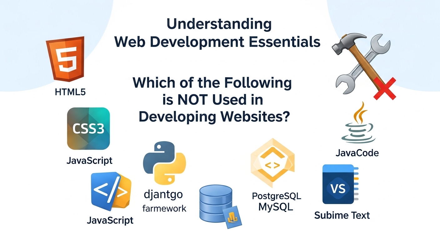
November 19, 2025
Which of the Following is NOT Used in Developing Websites? Understanding Web Development Essentials
When diving into the world of web development, it's easy to get confused by the sheer volume of technologies, tools, and programming languages available. Whether you're a business owner trying to understand what your website development services provider is using, or an aspiring developer learning the ropes, knowing which tools are actually used in website development—and which are not—is crucial. This comprehensive guide will help you distinguish between genuine web development technologies and those that belong to entirely different domains. Understanding these distinctions can save you time, money, and confusion when building or maintaining your online presence. Core Technologies Actually Used in Website Development HTML, CSS, and JavaScript: The Foundation Every website you've ever visited relies on three fundamental technologies. HTML (Hypertext Markup Language) structures the content, CSS (Cascading Style Sheets) handles the visual presentation, and JavaScript adds interactivity and dynamic functionality. According to MDN Web Docs, these three technologies form the cornerstone of all web development, regardless of how complex or simple a website might be. Think of HTML as the skeleton of a website, CSS as its clothing and appearance, and JavaScript as the nervous system that makes everything respond to user actions. Backend Programming Languages While the frontend handles what users see, backend technologies power everything behind the scenes. Languages like PHP, Python, Ruby, Java, and Node.js (JavaScript on the server) process data, manage databases, and handle user authentication. These languages work together with databases like MySQL, PostgreSQL, and MongoDB to store and retrieve information. Professional developers choose backend technologies based on project requirements, scalability needs, and performance considerations. There's rarely a one-size-fits-all solution, which is why experienced teams offer comprehensive approaches to match your specific needs. Frameworks and Libraries Modern web development heavily relies on frameworks and libraries that speed up development and improve code quality. React, Angular, and Vue.js dominate frontend development, while Django, Laravel, Ruby on Rails, and Express.js are popular backend frameworks. These tools provide pre-written code and established patterns that developers can leverage to build robust websites more efficiently. Technologies NOT Used in Website Development Desktop Application Languages (Traditional Context) Languages primarily designed for desktop software development, such as Swift (for macOS and iOS apps) and Objective-C, are not typically used for website development. While Swift and Objective-C create applications you download and install on your device, websites run in browsers without installation. That said, the line has blurred somewhat with progressive web apps (PWAs), but traditional desktop application technologies remain distinct from web development tools. System Programming Languages in Direct Web Context Low-level languages like Assembly or certain implementations of C are designed for system programming, operating systems, and embedded systems. While servers running websites might be programmed using these languages at the infrastructure level, they're not used to build the websites themselves that users interact with. Hardware Description Languages Languages like VHDL (VHSIC Hardware Description Language) and Verilog are used for describing electronic circuits and digital logic systems. These belong to the domain of electrical engineering and chip design, not web development. No matter how advanced a website becomes, you'll never need hardware description languages to build it. Statistical and Mathematical Software While data analysis tools like MATLAB, SPSS, or Stata are powerful in their domains, they're not web development technologies. However, you might use Python libraries (which can be used in web development) to perform similar statistical functions within a web application. The distinction is important: the tool itself versus a general-purpose language that can perform similar tasks. Microsoft Excel and Spreadsheet Software This might seem obvious, but it's worth mentioning: spreadsheet applications like Microsoft Excel, Google Sheets, or LibreOffice Calc are not website development tools. While you might use spreadsheets for planning website content or organizing data, they don't create functional websites. Some developers export data from spreadsheets to populate websites, but the spreadsheet software itself isn't part of the development process. Common Misconceptions About Web Development Tools "Visual Builders Replace Coding Entirely" Platforms like WordPress, Wix, and Squarespace use web development technologies under the hood, even though they provide visual interfaces. The W3C (World Wide Web Consortium) standards still govern what these platforms produce. Visual builders are tools that simplify access to web technologies—they don't replace them. "Any Programming Language Can Build Websites" While many programming languages can contribute to web development, not all are practical or designed for it. You theoretically could use unusual approaches, but established web technologies exist because they're optimized for browser environments, server architectures, and web-specific challenges. "Databases Are Optional" Simple static websites might not need databases, but any site with user accounts, dynamic content, or interactive features requires database technology. Systems like MySQL, PostgreSQL, or NoSQL databases like MongoDB are integral to modern web development, not optional add-ons. How Professional Developers Choose the Right Tools Professional web developers select technologies based on several factors: project scope, performance requirements, scalability needs, budget constraints, and maintenance considerations. They avoid technologies that aren't suited for web environments, regardless of how powerful those tools might be in other contexts. When you work with experienced professionals, they'll recommend proven web technologies rather than experimenting with tools designed for different purposes. This expertise ensures your website is built on a solid foundation using industry-standard practices. According to research from Stack Overflow's Developer Survey, the most commonly used technologies remain those specifically designed for web development, proving that the industry consistently relies on purpose-built tools rather than repurposing technologies from other domains. Why Understanding These Distinctions Matters For Business Owners When hiring developers or evaluating proposals, knowing which technologies are actually used in web development helps you ask informed questions. If a developer suggests using tools clearly outside the web development realm without good explanation, that's a red flag. For Learning Developers Aspiring web developers can waste months learning technologies that won't help them build websites. Focus your education on proven web technologies with active communities, extensive documentation, and strong job market demand. For Project Planning Understanding what technologies are genuinely needed prevents scope creep and budget inflation. You won't be sold unnecessary tools or services that don't contribute to your website's functionality. The Future of Web Development Technologies Web development continues evolving with technologies like WebAssembly enabling languages like C++ and Rust to run in browsers, and frameworks like Next.js and Svelte pushing new boundaries. However, even as the landscape changes, the core principles remain: websites need technologies designed for browsers, servers, and the internet's unique architecture. Emerging technologies that succeed in web development do so because they're built with web constraints and opportunities in mind, not because they're powerful in unrelated domains. Understanding which technologies are—and aren't—used in website development empowers you to make better decisions, whether you're building a site, hiring developers, or learning the craft yourself. The web development ecosystem uses specific tools optimized for browser environments, server architectures, and user experience needs. While the technology landscape constantly evolves, the fundamental distinction remains clear: website development uses technologies purpose-built for the web, not tools designed for desktop applications, hardware design, or statistical analysis. By focusing on proven web technologies and working with knowledgeable professionals, you'll ensure your website is built on a solid, maintainable foundation.
Read More
November 19, 2025
How to Find a Good Website Developer: A Complete Guide
In today's digital landscape, your website is often the first impression potential customers have of your business. Whether you're launching a startup, expanding your online presence, or revamping an outdated site, finding a good website developer can make or break your digital success. But with countless developers claiming to be the best, how do you separate the truly skilled professionals from the rest? The process of finding the right website developer doesn't have to be overwhelming. With the right approach and knowledge of what to look for, you can connect with a professional who understands your vision and has the technical expertise to bring it to life. Understanding Your Website Needs First Before you even begin your search for a website developer, take time to clarify what you actually need. Are you looking for a simple informational website, an e-commerce platform, or a complex web application? Different developers specialize in different areas, so understanding your requirements will help you narrow down your options effectively. Consider your budget, timeline, and long-term goals. A good website developer will want to understand these factors upfront to ensure they can deliver a solution that meets both your immediate needs and future growth plans. Key Qualities of a Good Website Developer Technical Expertise and Portfolio A reliable website developer should have a robust portfolio showcasing their previous work. Don't just glance at the designs—dig deeper. Visit the live websites they've built, test their functionality, check loading speeds, and see how they perform on mobile devices. This hands-on research reveals far more than screenshots ever could. Look for developers who stay current with technology trends. The web development landscape evolves rapidly, and a good developer invests time in learning new frameworks, security protocols, and best practices. Communication Skills Technical brilliance means nothing if your developer can't communicate effectively. A good website developer listens to your ideas, asks clarifying questions, and explains technical concepts in language you can understand. They should be responsive to your messages and provide regular project updates without you having to chase them down. Problem-Solving Ability Website development inevitably involves challenges and unexpected obstacles. The best developers approach problems with creativity and persistence rather than making excuses. Ask potential developers about difficult projects they've handled and how they overcame obstacles. Their answers will reveal their problem-solving approach. Where to Find Quality Website Developers Professional Development Agencies Working with established agencies often provides added security and comprehensive services. Professional firms typically have teams with diverse skill sets, ensuring your project benefits from multiple perspectives and expertise areas. If you're looking for comprehensive website development services, partnering with an experienced agency can provide the full-stack solutions your business needs. Freelance Platforms and Referrals Platforms like Upwork, Toptal, and Fiverr host thousands of website developers with varying skill levels. While these platforms offer convenience, they require careful vetting. Read reviews thoroughly, check ratings, and always review portfolios before making contact. Personal referrals remain one of the most reliable ways to find a good website developer. Ask other business owners, colleagues, or industry contacts about their experiences. A developer with a proven track record of satisfied clients is more likely to deliver quality work. Questions to Ask Potential Developers When interviewing candidates, ask about their development process. How do they handle revisions? What happens if you're not satisfied with the results? Do they offer post-launch support and maintenance? A professional website developer will have clear answers to these questions and documented processes. Inquire about their approach to responsive design, website security, and search engine optimization. These elements are crucial for modern websites but are sometimes overlooked by less experienced developers. Red Flags to Avoid Be cautious of developers who promise unrealistic timelines or refuse to provide references. Avoid those who use overly technical jargon to confuse rather than educate, or who demand full payment upfront without milestones. A good website developer is transparent about processes, realistic about timelines, and confident enough in their work to offer guarantees or revision policies. Making Your Final Decision After researching, interviewing, and comparing options, trust your instincts alongside the facts. The right website developer combines technical skills with professionalism, clear communication, and a genuine interest in your project's success. Remember that the cheapest option rarely delivers the best value. Quality website development is an investment in your business's future. A well-built website can generate leads, increase sales, and strengthen your brand for years to come. Finding a good website developer requires patience, research, and clear communication about your needs. By focusing on proven expertise, strong portfolios, effective communication, and professional business practices, you'll be well-equipped to make an informed decision. Your website is too important to leave to chance—take the time to find a developer who can transform your digital vision into reality.
Read More
November 17, 2025
When and Why Your Business Needs a Website Redesign
Is your website working as hard as it should for your business? Many companies continue operating with outdated websites, unknowingly losing customers, revenue, and competitive advantage every single day. Understanding when to invest in website redesign services can be the difference between thriving online and falling behind your competition. What is a Website Redesign? A website redesign goes beyond simple cosmetic updates. It's a comprehensive overhaul that improves visual design, enhances functionality, optimizes user experience, and aligns your digital presence with current business goals. Unlike minor updates or content refreshes, a redesign fundamentally transforms how your website looks, feels, and performs. Professional redesigns address both front-end elements that visitors see and back-end systems that power your site, ensuring everything works together seamlessly to achieve your business objectives. If you're looking for comprehensive website development services, expert teams can guide you through the entire redesign process. Clear Signs You Need a Website Redesign Recognizing the signs you need a website redesign helps you take action before losing valuable opportunities: Outdated Visual Design: If your website looks like it was built five years ago, it probably was. Design trends evolve rapidly, and what seemed modern in 2020 now appears dated. Visitors judge your business credibility within seconds of landing on your site. An outdated design signals that your company isn't keeping pace with industry standards. Poor Mobile Experience: Over 60% of web traffic comes from mobile devices. If your site doesn't display properly on smartphones and tablets, or if users must pinch and zoom to read content, you're frustrating the majority of your audience. Google also penalizes mobile-unfriendly sites in search rankings. Slow Loading Speed: Page speed directly impacts bounce rates and conversions. If your site takes more than three seconds to load, you're losing potential customers. Slow performance stems from bloated code, unoptimized images, outdated hosting, or inefficient databases—all fixable through proper redesign. High Bounce Rate: When visitors leave immediately after arriving, your website isn't engaging them effectively. High bounce rates indicate poor user experience, irrelevant content, confusing navigation, or design that doesn't match visitor expectations. Declining Search Rankings: If your organic traffic has dropped significantly, outdated technology, poor mobile optimization, or lack of modern SEO best practices might be responsible. Search engines favor websites that provide excellent user experiences and follow current technical standards. Difficult Content Management: Struggling to update your own website wastes time and money. If simple changes require developer assistance or your content management system feels clunky and outdated, a redesign with a modern CMS streamlines operations. Not Converting Visitors: Ultimately, your website should drive business results. If traffic doesn't translate into leads, sales, or desired actions, your site isn't effectively guiding visitors through conversion funnels. Benefits of Website Redesign Investing in professional website redesign services delivers substantial returns: Improved User Experience: Modern navigation structures, intuitive interfaces, and clear calls-to-action guide visitors smoothly toward conversion points. When users easily find what they need, they're more likely to take desired actions. Professional website development services ensure your redesign prioritizes user experience at every touchpoint. Better Search Engine Rankings: Redesigns implementing current SEO best practices, mobile optimization, fast loading speeds, and proper technical structure help your site rank higher in search results, driving more organic traffic. Increased Conversion Rates: Strategic redesigns focus on removing friction points, clarifying value propositions, and optimizing conversion paths. Even small improvements in conversion rates significantly impact revenue. Enhanced Brand Perception: Your website is often the first impression potential customers have of your brand. A professional, modern design builds trust and credibility, positioning your business as an industry leader. Competitive Advantage: While competitors stick with outdated websites, your fresh, high-performing site captures market share and positions you as the forward-thinking choice. Mobile Optimization: Redesigns prioritizing mobile experience ensure every visitor enjoys seamless browsing regardless of device, expanding your potential customer base. Improved Security: Modern websites include current security protocols protecting both your business and customer data from increasingly sophisticated cyber threats. Understanding the Website Redesign Process Professional website redesign process typically includes these phases: Discovery and Analysis: Reviewing current site performance, identifying problems, researching competitors, defining goals, and establishing success metrics. Strategy Development: Creating comprehensive plans for information architecture, user flows, content strategy, and technical requirements. Design Phase: Developing wireframes and mockups that visualize the new design, ensuring alignment with brand identity and user expectations. Development Phase: Building the redesigned site using modern technologies, implementing responsive design, and integrating necessary functionalities. Content Migration: Transferring existing content, optimizing for SEO, and creating new content where needed to fill gaps. Testing and Quality Assurance: Thoroughly testing across devices, browsers, and scenarios to ensure flawless performance before launch. Launch and Optimization: Deploying the new site, monitoring performance, and making data-driven adjustments to maximize results. Website Redesign Cost Considerations Website redesign cost varies significantly based on complexity, features, and scope. Small business redesigns might range from $5,000 to $15,000, while mid-sized company projects typically cost $15,000 to $50,000. Enterprise-level redesigns with extensive functionality can exceed $100,000. Cost factors include design complexity, custom functionality requirements, content volume, integrations with other systems, and ongoing maintenance needs. While investment seems substantial, the return from improved conversions, better user experience, and competitive positioning typically justifies the expense within months. Your website is your most important marketing asset. When it's outdated, slow, or failing to convert visitors, every day without redesign costs you money and opportunities. Recognizing the signs you need a redesign and partnering with experienced professionals transforms your digital presence into a powerful business growth engine. Don't let an underperforming website hold your business back. The right redesign investment pays dividends through increased traffic, higher conversions, and stronger brand perception. Partnering with experienced website development services ensures your redesign delivers maximum ROI.
Read More


