If you search for the best product landing page examples, you will find dozens of lists showing screenshots with short descriptions. Most of them repeat the same brands and the same surface level observations. What they fail to explain is why certain landing pages convert at high rates while others fail, even when the design looks attractive.
I have worked on product landing pages for service businesses, digital agencies, and ecommerce brands. Some pages looked stunning but did not convert. Others looked simple but produced consistent leads and sales. The difference was never just design. It was structure, clarity, and alignment between traffic intent and message.
In this guide, I will break down what truly makes the best product landing page examples effective. You will see real brand examples, practical frameworks, diagrams, and strategic insights that you can apply immediately.
This is not theory. This is based on real implementation experience and conversion focused thinking.
What Makes a Product Landing Page “The Best”?
Before looking at examples, we need a clear definition.
A product landing page is a focused page designed to sell one specific product or offer. Unlike a homepage, it removes distractions and pushes the visitor toward one main action.
The best product landing page examples share five non negotiable elements:
- Clear promise above the fold
- Strong visual hierarchy
- Emotional and logical persuasion
- Social proof and credibility
- Friction free call to action
If even one of these is weak, conversion rates drop.
Here is a simple conversion flow diagram that top landing pages follow:
Traffic Source
      ↓
Clear Headline and Promise
      ↓
Problem Recognition
      ↓
Product Solution
      ↓
Proof and Trust
      ↓
Offer and Call to Action
If your page jumps directly to “Buy Now” without walking the user through this flow, you lose conversions.
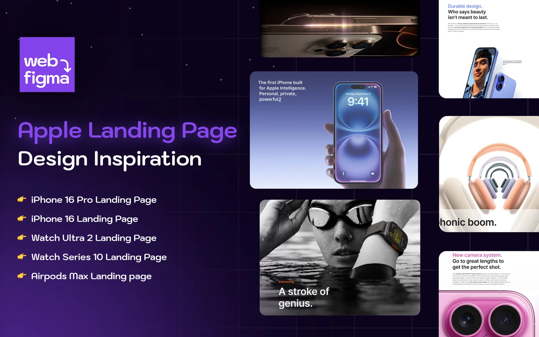
Example 1: Apple Product Pages

When discussing the best product landing page examples, it is impossible to ignore Apple.
Apple’s product pages are masterclasses in clarity and focus.
Why They Work
Apple uses a simple structure:
Large bold headline
Single clear value proposition
High quality product visuals
Minimal but powerful copy
They do not overload users with technical data at the beginning. Instead, they sell the outcome first. For example, instead of listing processor speed immediately, they highlight speed, power, creativity, or freedom.
Only after emotional engagement do they introduce specifications.
What You Can Learn
You do not need a complicated layout to convert. You need clarity. Most businesses try to say everything at once. Apple proves that controlled information flow increases persuasion.
In my own projects, whenever I simplified the hero section to one strong promise instead of three benefits, conversion rates improved significantly.
Example 2: Shopify Product Focus Pages


Shopify product pages show another approach. Instead of selling a physical product, they sell a platform.
Why They Work
Their landing pages focus heavily on:
Clear problem identification
Benefit driven subheadings
Strong trust signals
Action oriented CTAs
Shopify pages often follow this structure:
Headline
Subheadline
Primary CTA
Customer testimonials
Feature breakdown
FAQs
Secondary CTA
Notice how frequently the call to action appears. It is not hidden at the bottom. It is repeated at strategic points.
Strategic Insight
Most small businesses make the mistake of placing only one CTA at the bottom. If users scroll, get convinced, and then have to scroll back up to act, friction increases.
One of my agency pages initially had a single form at the end. After adding mid page CTAs and trust badges, leads increased without changing traffic volume.
Example 3: Tesla Vehicle Pages

Tesla uses immersion and simplicity.
Why They Work
Tesla’s landing pages rely on:
Full screen visuals
Minimal text
Clear configuration steps
Emphasis on lifestyle
The design is distraction free. No unnecessary menus. No side offers. The focus is entirely on the vehicle.
Tesla also uses interactive elements to increase engagement. When users interact, psychological ownership increases, making purchase more likely.
What You Should Not Copy Blindly
Many brands try to copy Tesla’s minimal text approach without having Tesla’s brand authority. If your brand is unknown, you need more trust elements.
Minimalism works only when trust already exists.
Example 4: Slack Product Page

Slack excels at clarity.
Why They Work
Slack focuses on simplicity and productivity. Their landing page communicates:
What it is
Who it is for
How it improves workflow
Instead of technical descriptions, they use relatable language. They show real use cases, not abstract benefits.
Experience Based Observation
When writing product landing pages for software tools, I noticed that feature lists alone do not convert. What converts is contextualization.
For example:
Weak copy
“Advanced dashboard with multi level analytics”
Stronger copy
“See exactly which campaigns are making you money in one clean dashboard”
The best product landing page examples always translate features into outcomes.
Structural Blueprint of High Converting Landing Pages
Below is a practical table you can use while building your own page.
| Section | Purpose | Common Mistake |
|---|---|---|
| Hero Section | Capture attention and state promise | Too many messages |
| Problem Section | Make visitor feel understood | Being too generic |
| Solution Section | Introduce product clearly | Over technical explanation |
| Proof Section | Build credibility | No testimonials |
| Offer Section | Present pricing or value | Hidden costs |
| FAQ Section | Remove objections | Ignoring real doubts |
If your page misses any of these, you are losing conversions.
The Psychology Behind the Best Product Landing Page Examples
The highest performing landing pages use psychology intelligently.
1. Clarity Reduces Anxiety
Confusion kills sales. If a visitor does not understand what you are offering within seconds, they leave.
2. Specificity Builds Trust
Instead of saying “High Quality Material,” say “Made from 100 percent organic cotton.”
Specific claims feel real.
3. Social Proof Reduces Risk
Testimonials, reviews, numbers, and case studies reduce perceived risk.
4. Visual Hierarchy Directs Attention
Large headlines
Medium subheadings
Short paragraphs
Whitespace
If everything looks equal, nothing stands out.
My Real Experience: What Actually Improved Conversion
I once redesigned a product landing page for a service based digital business. The old version had:
Long paragraphs
No visual breaks
Weak headline
Only one CTA
Traffic was decent but conversions were low.
We changed:
Headline to focus on one strong outcome
Added three customer testimonials
Inserted CTA buttons after every major section
Rewrote features into benefits
Result was a significant improvement in lead submissions within weeks.
What changed was not design complexity. It was clarity and structure.
Content Depth vs Simplicity
A common misconception is that shorter pages convert better. That is not always true.
The best product landing page examples match content depth with product complexity.
Low price impulse product
Short persuasive page works
High ticket product
Long detailed page works better
Users buying expensive products want reassurance.
Instead of cutting content, structure it better.
Visual Framework for an Ideal Product Landing Page
Here is a simplified content structure model:
Headline
Subheadline
Primary CTA

Image or Video

Problem Statement

Solution Explanation

Feature to Benefit Breakdown

Social Proof

Offer and Guarantee

FAQ

Final CTA
If your layout follows this logical flow, user experience improves naturally.
Common Mistakes That Ruin Landing Pages
Brutally honest truth. Most landing pages fail because of these:
Too many navigation links
No clear value proposition
Weak or generic headlines
Stock images with no authenticity
No testimonials
Slow page speed
Hidden pricing
Design alone will not fix strategic problems.
How to Create Your Own Best Product Landing Page
Instead of copying big brands, do this:
Step one
Understand your target audience deeply. What exact problem are they trying to solve?
Step two
Write a clear promise in one sentence.
Step three
Support that promise with proof.
Step four
Remove unnecessary distractions.
Step five
Test and improve continuously.
Landing pages are not one time creations. They evolve.
Frequently Asked Questions
What is the difference between a product page and a landing page?
A product page is usually part of an ecommerce store and includes navigation, related products, and multiple options. A landing page is focused on one goal and removes distractions to maximize conversions.
How long should a product landing page be?
Length depends on product complexity and price. High ticket or complex products need more explanation and trust elements. Low cost products can convert with shorter pages if the value is clear.
Do I need testimonials on every landing page?
Yes, unless you are a globally recognized brand. Testimonials reduce doubt and increase trust. Even two strong reviews are better than none.
Should I use video on my landing page?
If your product requires demonstration, video can significantly improve understanding. However, it must load fast and support the message, not distract from it.
How many CTAs should a landing page have?
You should have one primary action but repeat the CTA throughout the page. Do not force users to scroll back up to convert.
Can a simple design outperform a complex one?
Yes. Clarity beats decoration. A clean focused page with strong messaging will outperform a visually impressive but confusing page.
Final Thoughts
The best product landing page examples are not defined by flashy design. They are defined by clarity, structure, trust, and persuasive storytelling.
Do not chase trends. Build pages that:
Speak directly to your audience
Highlight one strong promise
Provide proof
Remove friction
Guide users toward action
For More Visits: Peak Media Consulting
Also Read: Best Big Companies to Work for in Houston TX